I think that although the title gives a lot away to the viewer it doesn't tell them enough for them to feel that they don't need to watch the movie. If anything it pairs well with our OTS in hooking them to the movie, begging the questions of how does the infatuation become fatal and how fatal turns out in the end. The title works well in English terms as it is almost alliteration with the two F's working together as a memory aid, another thing that works extremely well for a title of a movie so that people remember the movie, with it rolling off of their tongue. Examples include Doctor Dolittle, Fantastic four, Peter Pan, Dirty Dancing, Man Made Monster, The Sixth Sense, What Women Want etc.
The next step is to look at typography, we do have an initial brief that included the Title looking very bold and at the same time have a bit of a rugged feel that looked slightly torn up. After today's lesson we thought that perhaps having the Fatal bit in more posh and feminine writing against a bold and rugged font of Infatuation would look really good together and forshadow the storyline of the two different stereotypes coming together.
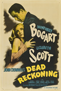

From these posters you can see that the conventions of fonts within film noir is captured through the boldness of the titles and the freshly painted effect that comes with the fonts they have used. Depending on the movies the font looks as though they capture the storylines such as 'Dead Reckoning' having a more dark disfigured font where as Laura has focused on the font being quite feminine which supports the movie being based around the female protaginist.
'Fatal' Ideas:

'Infatuation' Ideas:


No comments:
Post a Comment